In the first phase of this study, I simplified—not by removing for the sake of minimalism, but by guiding the client through what still belonged in this next season of life and what no longer did.
Because Simplified Living always starts there—with clarity, intention, and an honest look at what the space is holding, both physically and emotionally.
Once the excess is removed, something important happens. The room becomes quiet. And that’s when organization can begin. Not as bins and labels, but as structure.
At its core, organization is about giving everything a place that supports how the space is meant to function moving forward. At Lake Crest, that meant creating a system that could hold three things at once: legacy, logistics, and connection.
And it started with the architecture.
Step One: Introduce Architectural Containment
Once the room was simplified, the next step was organizing—and that began with structure. Because organization without containment is only temporary.
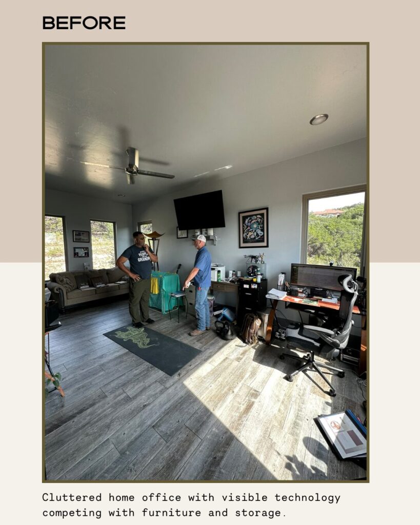
At Lake Crest, the walls were originally blank. No built-ins. No architectural depth. Just drywall and scattered furniture, trying to do the work of storage.
So I created the container first.
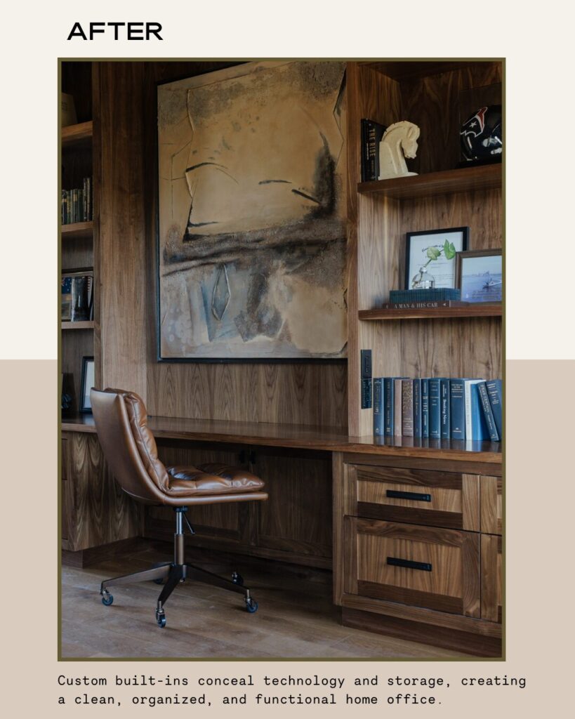
I introduced warm, medium-toned alder wood built-ins that now anchor the study with permanence and proportion. One wall holds the built-in desk and shelving that showcases meaningful pieces from our client’s life—career milestones, masculine artifacts collected over decades, vintage and historical books, and small plants that soften the wood without competing with it.
This isn’t clutter. It’s legacy.
Paperwork, however, tells a different story. Behind the millwork, built-in file drawers conceal documents and administrative materials completely. No visible stacks. No trays on the desk. Not even a paper weight to interrupt the visual calm.
The visible layer celebrates identity. The hidden layer supports function.
This distinction is essential.
Organization isn’t about removing personality—it’s about separating legacy from logistics. When storage becomes part of the architecture, the room no longer feels assembled and instead feels established.
And once the structure is in place, the rest of the organization can follow.
Step Two: Correct the Flow
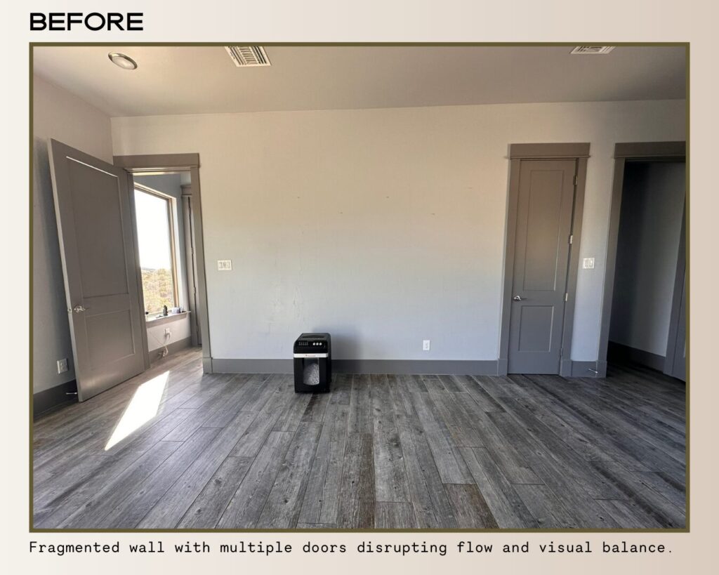
The 13-foot wall originally held three doors—two entry doors and one closet door. The issue wasn’t the number of doors, but how they were placed.
The closet door sat just inches from one of the main entry doors, creating two doors side by side on one end of the wall, while the second entry door was positioned at the opposite end. Visually, the wall felt off balance. Your eye didn’t know where to land, and the space’s overall flow felt disrupted.
Instead of removing the closet entirely, I rethought how it appeared in the space.
I concealed it.
A custom bookshelf was designed to function as a hidden door, opening into the tech closet while blending seamlessly into the rest of the wall. From the exterior, the wall now reads as one continuous, intentional design, while still housing the necessary infrastructure behind it.
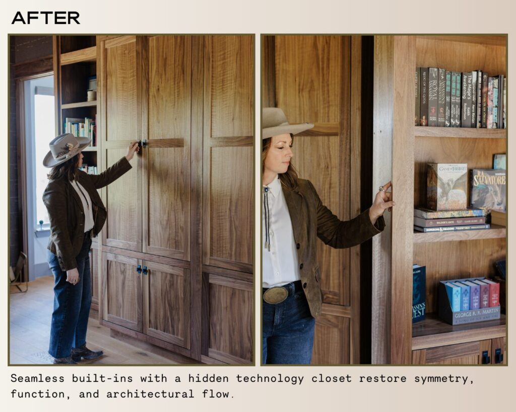
This is where organization and architecture begin to work together. When a space has clear flow, it no longer feels fragmented—it feels settled, balanced, and easy to move through.
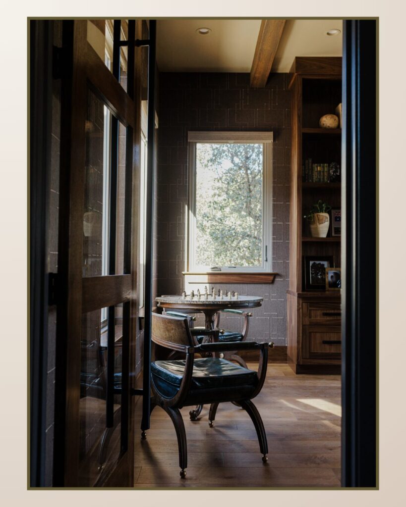
Step Three: The Connection Zone (Chess & Reading Nook)
This zone represents the future.
As you enter the study, the handcrafted chess table becomes the first signal that the room is no longer purely administrative. It sits intentionally positioned near the window wall—quietly announcing that this space is now about presence and connection.
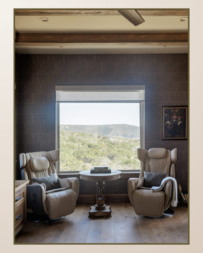
Across the room, the reading nook creates a second moment of pause.
Two sculptural recliners face the Hill Country view, anchored by a twisted mango wood table that feels almost organic in form—like roots rising from the floor. This corner was designed for slower rhythms: evening conversations, reading, and the kind of quiet time that only comes when life begins to shift into retirement.
Each zone contains only what it needs—the chess area holds the handcrafted board and vintage Widdicomb Empire chairs; the reading nook holds two performance recliners and a single table between them.
Nothing extra. No accessory clutter. No secondary storage. No visual noise competing with the architecture.
Nothing extra. No accessory clutter. No secondary storage. No visual noise competing with the architecture.
When zones are clearly defined, maintenance becomes natural. Legacy, logistics, and connection each have their own container. And when that happens, the room stops feeling busy and begins to feel settled.
That’s Simplified Living in structure. Grounded in purpose. Curated for everyday life.